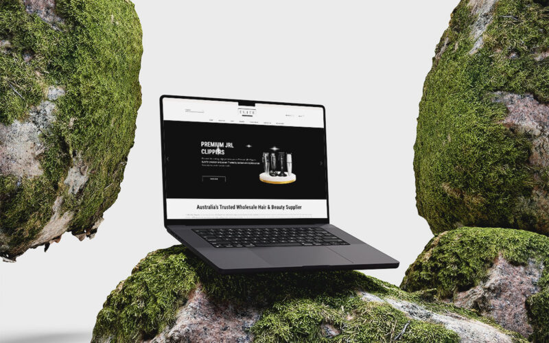
Elite Hair Supplier Web Design
Elite Hair Supplier
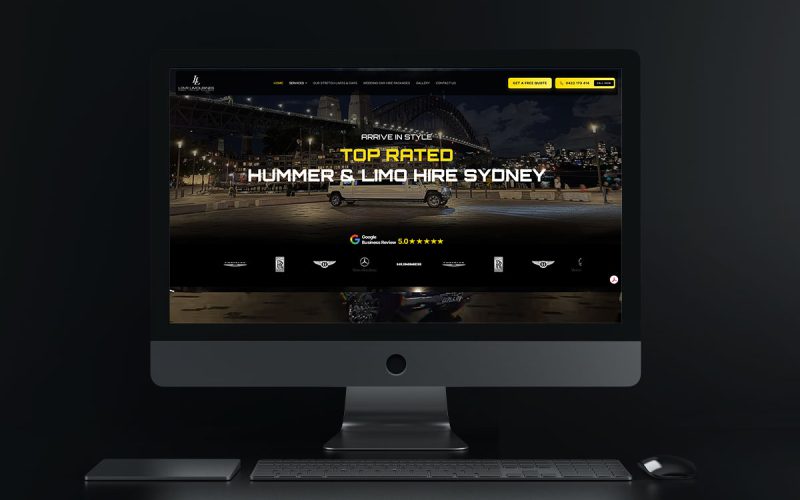
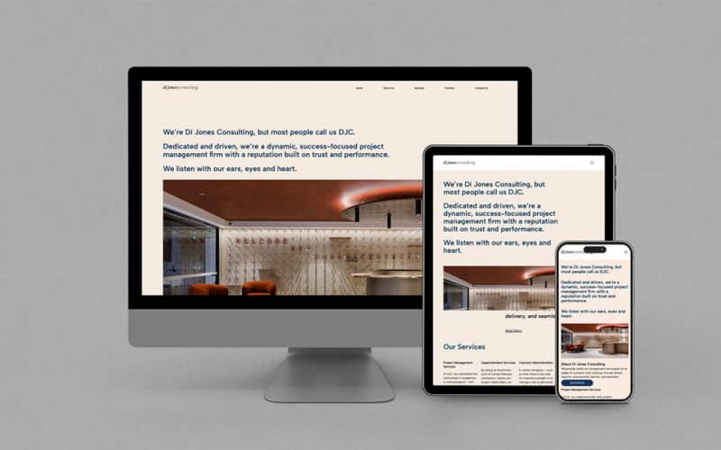
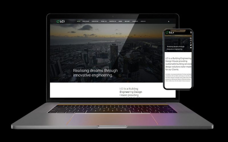
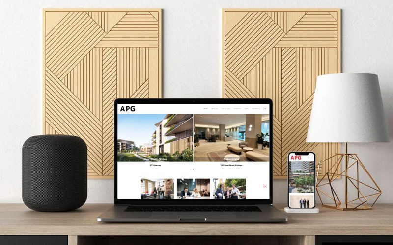
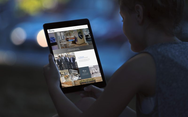
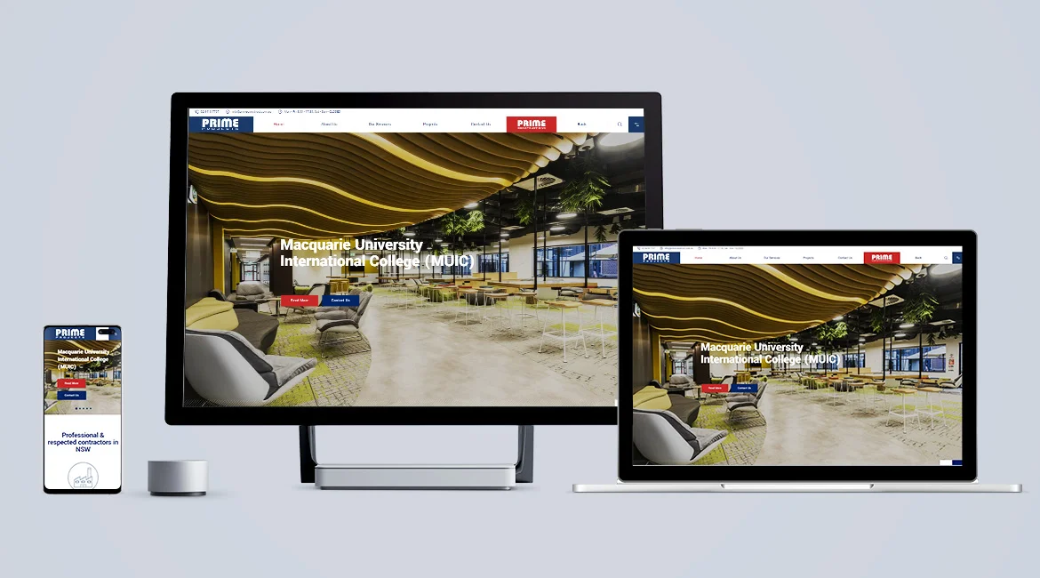
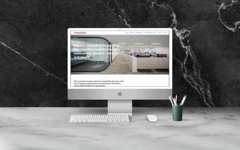
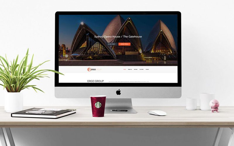
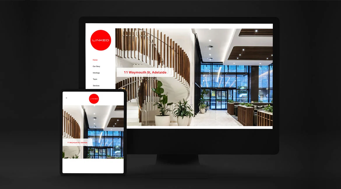
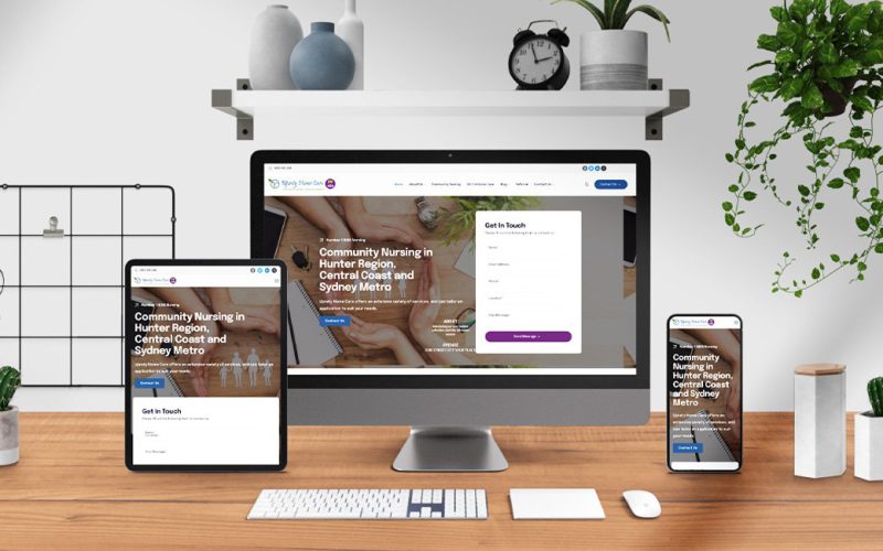
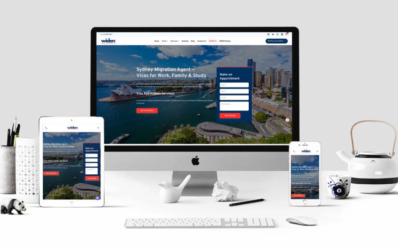
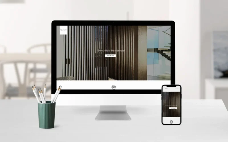
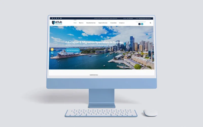
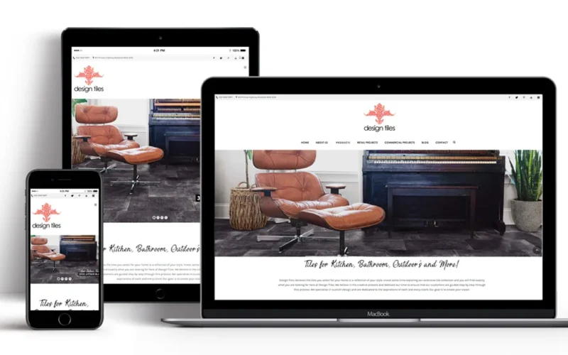
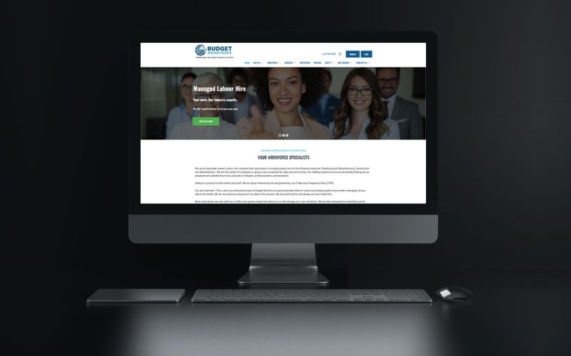
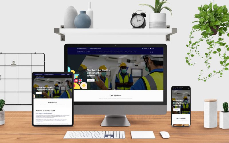
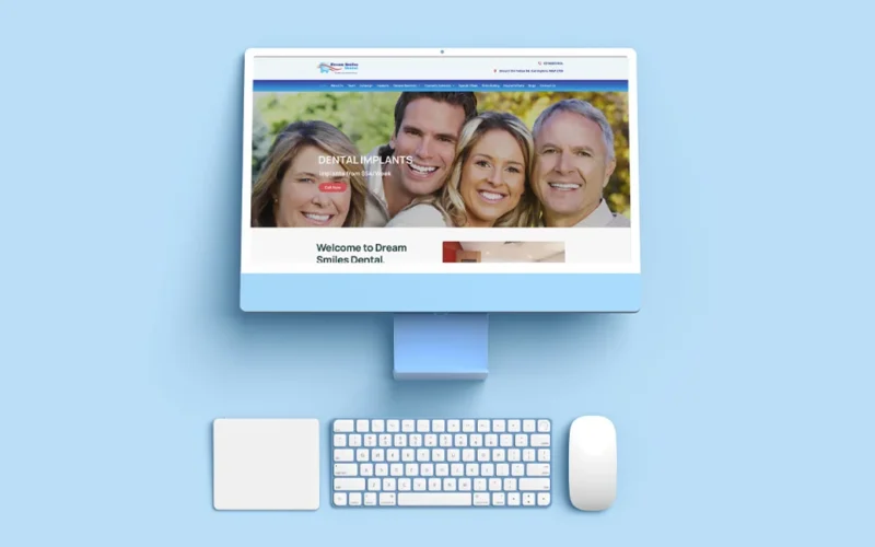
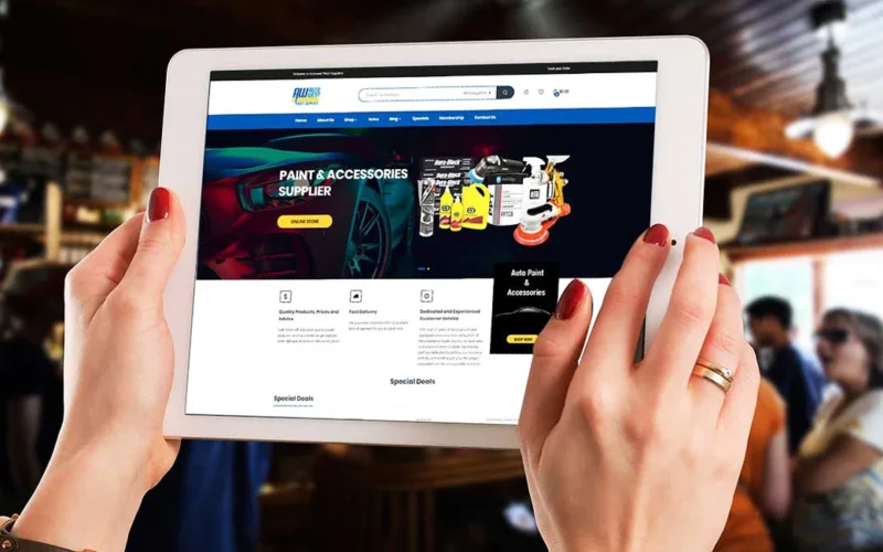
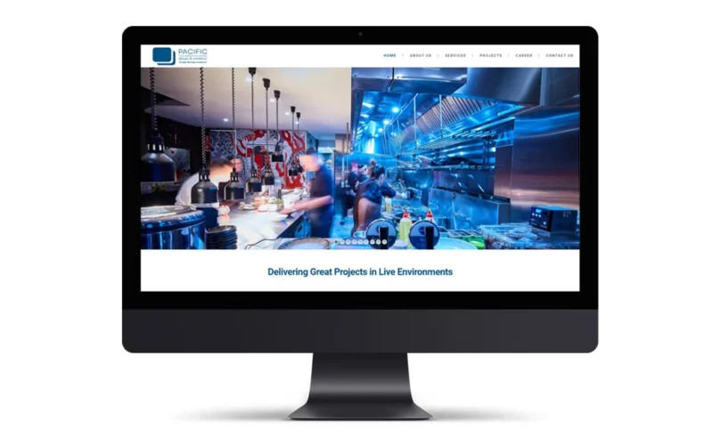
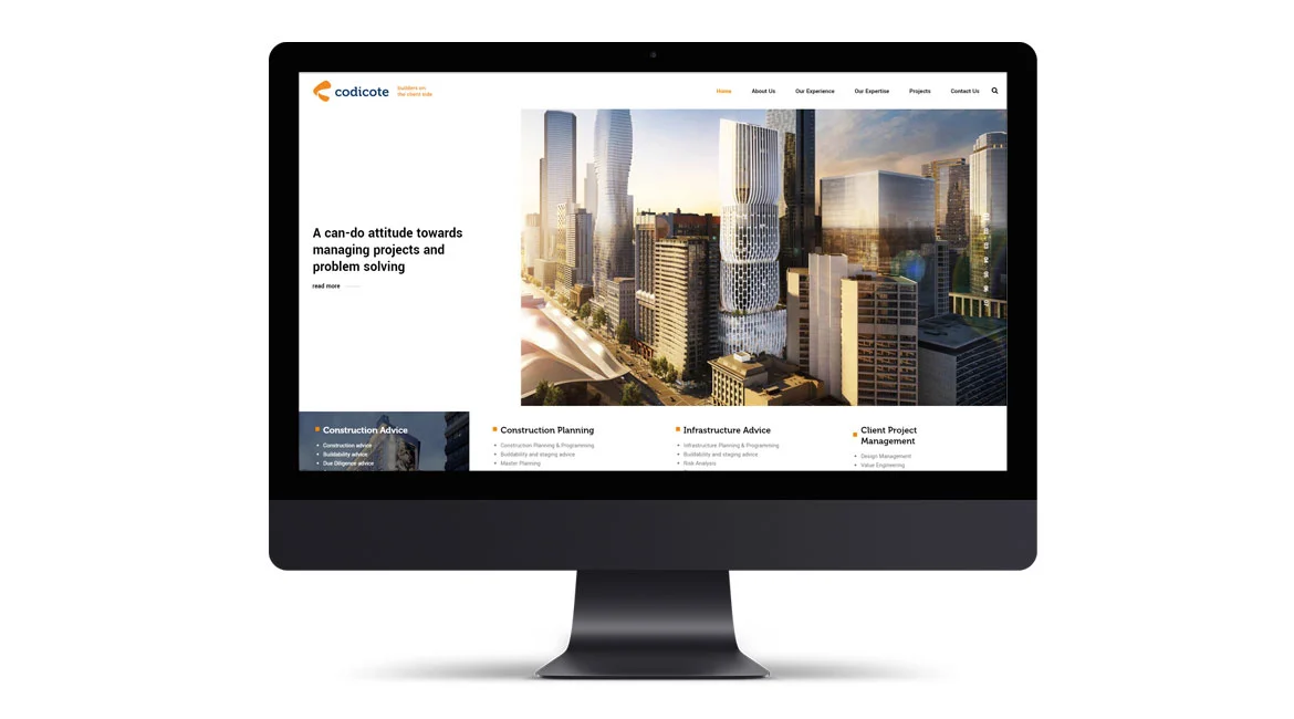
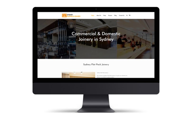
Every project below was designed, built, and launched by our senior Sydney team - no templates, no offshoring, no shortcuts. From corporate consultancies and healthcare practices to eCommerce stores and trade businesses, this is the work that earned us a 5-star Google rating and 98% client retention since 2009.
Let's talk about your project. Free consultation, no obligation — just a straight conversation about what's possible.
Free consultation · Fixed-price quotes · No lock-in contracts · Based in Parramatta, Sydney